So today I began to do my research for my new assignment FAMILY.

Bill, our tutor introduced us to an artist by the name of Richard Billingham.

He is renowned for his fly on the wall documentary style photographing and videography of his family.

Richard Billingham (born 25 September 1970) was born in Birmingham UK, about an hour away from me. He studied at Bournville College of Art as a painter. He stumbled across what he is now famous for by taking numerous photographs of his family in action to then select just one single image to paint for his assignment. When showing his tutor the images, his tutor told him he was done, that ALL of these images were his final piece of work and needed to do no more AND THAT WAS THAT!
He went on to to take CANDID PHOTOGRAPHY of his family which finally became a book called RAYS A LAUGH (his fathers name being Ray)

I found after looking at his images, my first impressions of his parents were that they were alcoholic, selfish people with poor hygiene. Once viewing one of my favourite videos the FISH TANK I looked at tem from a totally different light. The dynamics and essence he captured through his photos and films is unique. The close up shots, almost following where you would be looking naturally if you were there are unique. 
You become for the duration of the move, a part of his family.

His family became totally oblivious to his filming and photographing after some time and I think this is what created the unique natural shots that he captured.

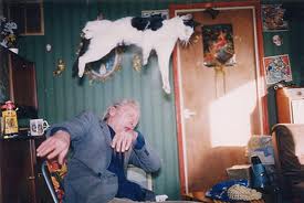
Dad Ray & cat!

Liz

RAY & LIZ


BILLINGHAM THEN WENT ON TO EXPLORE LANDSCAPE PHOTOGRAPHY.
Yesterday I was given an assignment as part of our  Visual Recording unit based on FAMILY

As part of this assignment I have to research and examine the meaning of family of family in the modern context. Asking myself:
What do families consist of, immediate family, extended family?
What types of families are out there...blended. typical 2:4, lone parent etc etc?

I will also research some well known photographers who have used their family as their subject, explore their techniques and researched how they capture the essence of their relationshi with each family member and the dynamics of the family on a hole. I feel that if I do this it will lead me to produce great photographs.....which leads me to the next art of the assignment.

I need to 'fill my boot' with images of my beautiful family in acton. preferably no posed shots, more photojournalism/documentry style instead.

Wish me luck and I will keep posted with my prgress

TTFN X

I came across a nice piece of work on the net based on Andy Warhol and his self portraits.

I think he is a very unique artist, which is obviously why he is known worldwide for his work.
Below are the 12 portraits featured in this post
I love the way each image has captured his personality in different ways, almost like representing the different sides of is personality. I will take this into account whilst experimenting with my own self portraits.

Self portrait
Self portrait

Self portrait


Self portrait

Bernard Gotfryd 1980s
Nancy Schiff 1981
Self portrait 1979
Richard Avedon 1969
WeeGee 1965
Self Portrait, 1979
Self portrait 1979

Stephanie Chernikowski, 1984

Robert Mapplethorpe, 1986


Leanne visual elements.ppt uploads from Leanne Tipton-Clark

I was given a mini task to do over the weekend. This was to put together a small 5-10 minute presentation summarising the last two weeks research on the visual elements.
I thought it would be easier to break it down if done in powerpoint so I wouldn't start going off on a tangent (which comes naturally to me)

I presented the above power point to my class on Monday, it seemed to go well although I need make a massive BOOBOO in one of the elements, see if you can spot it in the slide show....Enjoy x
I have been given a project on self portraits, taking into account the visual elements. I thought I would add a twist by doing a collage of symbolic self portraits instead, I mean, who wants to look at my ugly mush!??

Texture: Cookie...I love my GF choc chip cookies
Texture & Pattern: My snake Ang has a lovely red black and yellow pattern and Ive managed to catch the texture of his skin too!
Pattern & Colour: In my retro pop bottles, taken in one of my fave sweety shops on the Albert Dock. I love Jelly Beans
Form & Tone/Value: My pregnant belly!
Line & Colour: My lips, I love wearing bright lipsticks
Shape: Me and my girls, one of my favourite places with my favourite people in the whole wide world!!!
Colour adds richness and character to everything. It has the capability to trigger different types of emotions in humans, male and female in different ways. It helps the world go round ( red means stop, green means go)
Learning how colour works together and how it affects us as humans will help create feeling in our images.
So this post is about my findings on how colour can be used and manipulated to help produce an awesome image!


This colour chart explains how colours work and how they can work together in harmony.
You have your PRIMARY colours of RED, YELLOW and BLUE
You then have your SECONDARY colours ( two primary colours mixed) of ORANGE, 
GREEN and PURPLE
Your tertiary colours (mixing 1 primary with one secondary, or two secondary colours) are your colours in-between like bluey greens etc
This wheel also explains your warm and cool colours. 

Now lets explain in detail:
 The WARM colours in the chart are welcoming, they are advancing and appear to approach you in a photograph. COOL colours in the chart above create a variety of emotions but the one thing they have in common is that they are receding, they mainly play a background role. They work beautifully in the background of an image and together with warm colours can help the WARMER colour advance even more!! Orange and blue is a good example of warm and cool working together as these are also COMPLIMENTARY colours too. Complimentary colours are colours that are opposite to each other on the colour wheel. A great example would be red and green, as its coming up to Christmas I thought it to be quite apt.

Your warm colours  RED ORANGE and YELLOW create feeling of energy, cool colours such as GREEN, BLUE and PURPLE are said to be calming.

Yellow and blue is another good example: Thats why road signs look so effective, the sign represents a strong energetic object while the background of the blue sky creates a calmness and recedes, helping the advancing yellow sign come towards the viewer.

I created this image when I noticed my reflection in my microwave window. I grabbed my phone and seized the moment. I was originally gazing out of the window so I tried to capture the same 'thinking' pose.
I love the way the mesh on the inside of the microwaves window has created texture in the image and the blue tones picked up are a great representation of the cold winters day outside.

About