For the new term we have been assigned a new unit. The unit is based on Studio Photography.

Throughout this unit I will be learning how to achieve different styles of studio photography by using different techniques, technology and media in the studio.
I will produce my own studio photography to demonstrate my findings, based on historical and contemporary studio photography practice.

On completion of this unit I will be able to:


  1. Understand the characteristics of studio photography
  2. Have an understanding about studio photographic media, techniques and technology
  3. Produce examples of own work/photography within the studio
  4. Review my own studio photography


So today in class we had a tutorial on ho to create a Triptych template in Photoshop.

Here is how we did it:

Step One: First of all I opened all three images I wanted to include in the triptych ensuring all images pixel dimensions are the same. This is done by going to Image > Image size


Step two:
I then created a new template, named it window, adjusted the canvas size to 6x9in, 250 pixels/inch background white.


 I created a new page with the above settings.

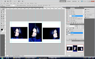
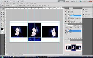
Step Three: Once my layer is open I make sure my guide ruler is on and snap tool is checked also. This was to enable me to snap a few guides onto my template to ensure the three images were going to be positioned correctly

Step Four: I then begin to drag my images across to my triptych template.(left click and drag)
I then move the images around to where I would like them then start to snap the ruler guidelines to ensure the images all align and are positioned correctly. This is were the snap tool comes in useful!
BEFORE
AFTER

Step Five: Once the images are in position you can adjust the background colour to whatever you like (I tend to use a shot of the surrounding landscape if I'm shooting on location) in this case I opted for a black.

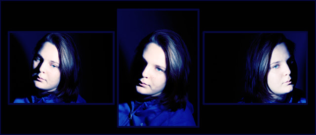
Step six: To highlight the frame of the images I add a stroke line to each frame in blue. This is how:


Merge all visable layers > select the area you wish to frame with the rectangular marquee tool (this is why the guides have not been removed yet) > Edit > Stroke > Then add the thickness by size of pixels, I go for 4 as I only want a fine line > OK > Hide all the guides by selecting "View" from the top menu bar, followed by "Show" and "Guides." This hides all the guides.


Voila
I want to save this Triptych as a template as you never know when it will come in handy. Here is how:

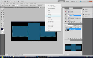
Step one: once the final image has been saved, duplicate layer, on that layer select the frame with RMTool again and right click and fill with colour. Do this to all three frames and it will look something like this.

Step two: 
Now on that top layer select the magic wand tool, highlight all boxes and inverse (see below image)

Hit delete and remove the background layer and this is your template:


To use this template over and over you simply drag and drop your images behind and adjust as needed with free transform. 
NB: Try to stick to the rule that applies right at the beginning of this tutorial  Ensure you images your transferring across are of the same size/pixels.


Our first masterpiece 

defeated......  by SHM


This is a 1.2 m² piece of artwork consisting of 100's of images of the 80's to create a mosaic portrait of Margaret Thatcher. We decided to call this piece of art defeated.... stemming from an infamous quote by Thatcher whilst in power Defeat—I do not recognise the meaning of the word!.As we all know the Baroness was kicked out of power by her own party and in turn her party then thrown out of power by new labour. The IRONY!! (excuse the pun, irony, iron, iron lady! cough cough)

On either side of the image of Thatcher are the portaits of my classmates and I from college(clockwise from top right Ayla, Jonathan, Lana, Julie, myself and Karl. The ones to the left where born pre 1980s and to the right post 1980s.

Our work was to represent the 1980s, the good and the bad...Thatcher being the latter of the two. We decided to have Thatcher in blue, the colder primary colour and us in yellow and red, the warmer of the primary colours. We wanted our portraits to appear as if we were laughing at Thatcher as she was defeated and look at the good that came out of the 80s, hence why we thought it was an excellent idea to form a portrait of Margaret Thatcher from a mosaic of all iconic images from the 1980s.


Mosaic Maggie....look closely!


placing our piece of art of the wall in college!
My team and I are extremely proud of our finished product and it is now displayed in the corridor of the arts and media department in college. Chuffed!!!

Inspired by artist Gilbert & George
Our class has now been divided into two groups, I'm in a group of six. Myself, Julie Ayla, Lana, Karl and Jonathon.

This morning in class we discussed what approach we should go for regarding our art work in relation to us as a team and Gilbert & George.
The subject we all seemed to agree on was the 80s. We decided that somehow, our finished masterpiece was to display all things 80s!
So first, we decided to gather images of stuff that represented the 1980s to us as a group and to us as individuals. Things like toys, sweets, tv programmes and clothing etc.

With Gilbert & George being renowned for their grid like structure I suggested using a rubix cube and the main backround image. The colours were perfect, in relation to Gilbert & George and it was a iconic symbol of the 80s. I also suggested that maybe we could use hundreds of images of iconic 80s memorabilia to make a mosaic. When put to the test, it did not work. In the assignment each member had to produce at least two images to be included in the finished product. The face of a rubix consisted of only 9 small grid like squares, we need at least 12.
So, I had another brainwave, Margaret Thatcher! Use her as the main image to generate a mosaic of 80s iconic images. I thought this was quite apt seen as though Gilbert and George were an oddity in the artistic world because of their openly conservative political views and their praise for Margaret Thatcher. George claims never to have been anti-establishment: "you're not allowed to be Conservative in the art world, of course", he says. "Left equals good. Art equals Left. Pop stars and artists are meant to be so original. So how come everyone has the same opinion? ... We admire Margaret Thatcher greatly. She did a lot for art. Socialism wants everyone to be equal. We want to be different."

Another member of our group suggested Maggie being in the colour blue, while our images could be in the warmer primary colours yellow and red!! We were firing on all cylinders now!

We did a trial run with my chosen image on http://click7.org/image-mosaic-generator/?create
It looked good. Now we had to decide how we were to get our faces on there too, just like the famous Gilbert and George did!
Our tutor Bill suggested using our portrait images we had taken for one of our previous assignments.....we were back on track again.
Over the next couple of days we ordered a high res image of the Maggie Thatcher image and set to work on editing our portrait images on photoshop. We also decided to take some new portrait shots of each other.

Lanas turn!
Karl doin the big fish little fish!
moi


I had been reading a book called Experimental photography by John Warren and when Karl suggested an Andy Warhol type of portrait effect a technique sprang to mind....LINE CONVERSION! Perfect!  Line conversion is a common technique used today, due to media production, half tone images in newspapers are used widely. Now we acheived this technique in photoshop by first of all converting the orignail portrait into black and white with an adjustment layer. We then used the artistic CUTOUT filter. Each portrait had the same level 2 through out. To then ensure the image had a true black and white conversion and no midtones we adjusted the LEVELS.
So our images went from this.....


Lea by SHM 2012


TO THIS.....
I then made a template in Photoshop to the size of three images by one, I dragged all the yellow images across onto this template and using the rulers guidelines set the images up so they were ready to print out and be put in their A3 frames. I suggested this method as it was easier to give them all the same colour yellow rather than doing it individually. We added a fill layer to the images with the yellow and in the drop down menu for layers we selected multiply. Tadah!!!
We did the same with the red portraits too!
Saving these templates along with the blue Maggie mosaic we were ready to print baby!!!!

We purchased the frames from a hardware store for a mere 2.50 each. Just thin black framed A3

We were now ready to print..........my next blog will include the final masterpiece

Our next assignment given by our tutor Bill was named After Gilbert & George.

In a nutshell, as a group and as an individual we had to research the artists Gilbert and George. Who they are, where did it all begin, their work throughout their career etc
With that information on-board we then, as a selected group, had to design and produce a work of art using a similar method and style as Gilbert & George did.

This is what I found during my research.....


Gilbert Proesch and George Passmore are two artists that work together to produce brightly coloured graphic style photographic art work. They work under the name Gilbert & George. They met in 1967 while studying sculpture at St Martins School of Art, starting off as performing artists they were living scupltures,  they then went on to produce a lot of controversial art work over the past 20years including Jack Freak pictures which is their largest collection. In all of their work they continue to use their figures as a main feature.

Most of their works backdrops are set in the East End of London shown by flags, maps, street signs, graffiti and other less obvious visual elements such as brickwork and foliage that can be found there. This is their home town and their work ortrays their views on life in the East End.

In my opinion, Gilbert & George are so off the cuff due to their approach to all things taboo. They have tackled nudity, bad language, poo and penises in their work and the image below is yet another taboo example....HOODIES! This image called HOODED was released when the yob culture hit an all time high 2005. I think in this image, GG were trying to portray that hoodies are unfairly stereotyped as yobs. Displayed in their trademark grid format, Gilbert and George appear to be holy like. With the white clothing and golden halo surrounding them whilst two stereotyped hoodies stand either side of them. Are they there to save the hoodies? Is the golden glow some form of protection from the so called yobs? Or are they trying to say there is nothing wrong with people who wear hoods and we are here to prove this!!??

Andrea Rose, director of visual art at the British Council, said: "Gilbert and George have made grand portraits from the hooded boys who live and work around Spitalfields, where the artists themselves have lived and worked together for more than 35 years.

"While others discuss banning youths from wearing hoodies, Gilbert and George find something positive to say about them."


I've finally sifted through the hundreds of images I had taken for my family project and reduced it to just a small collection, as I stated earlier in my other post, my photography technique would be natural action shots. The composition for the majority of these images was to capture what my eye sees in a natural way...this was angle, lighting, colour to enhance the moods etc. I shot in complete manual mode because when I shot in Aperture Priority the images became blurry due to slow shutter speed to keep the light coming in. ISO was cranked up to 3000, the room was just too dull at times thanks to the winter months!!

Nannypop
This image is a shot of my dear mother Julie and my youngest daughter Evie. Evie and my mum share a passion of clothing, this image shows nanny giving Evie a new top she had bought her earlier that day x I think I timed the looking space on both subjects down to a t! Both are looking at the topic of the conversation (Evies new top) I liked the way my mum is looking down with a gentle smile on her face and holding the top against Evie. It displays her love for her granddaughter.


HOHO GLOW
In this image my daughter Evie was dressing up. She had just found the jazzy Santa hat in the decorations box. This close up was how close I was to Evie at the time, as I stated earlier, I want my viewers to see exaclty what my naked eye could see at the time. I added a few fill layers on photoshop to soften and warm the image up. My little teddy bear!

death by ipod
This image is of my eldest daughter Sarah. By this point she was oblivious to me taking photographs of her, partly because Id taken so many beforehand and partly because she was engrossed with the contents of her Ipod. This image is so natural, taken sat on the floor next to her on bed I just clicked away while she was chatting to friends.


Evie dont mind them
I put these together as they come in sequence. Grandad was letting my snake Ang stretch his legs and cheeky Evie wanted to get in the shot.
Mum in the background was in a world of her own until I started laughing at Evie pulling faces....which brought her attention to the snake....HAHA look at mums face x
I love the way I made the snake the main focal point of the second image with mums horrified face in the background


Mum hates snakes!
                                      i
                                                   Sausage in the middle 
Evie & Gangang
Buddah and Me
Evie wasnt bothered about  me taking photos anymore and FINALLY stopped posing hehe, This shot is beautiful, Evie sat there for some time with her head on "Grandad"


Lawn darts 
This is my favourite image out of the collection, I just love the composition and the message it gives across to me. I caught Evie sulking as her lawn darts werent sticking in the ground. Evie is a little OCD and only plays with the matching ones (this time blue). It was a cold morning and the sun was shining making it bright and fresh, seconds beofre the photo was taken Evie turned around and said "silly floor". I think the rays of the sun through the trees help portray the weather, cold and crisp.

Buddah and Me

Potty & choc choc

I walked in to find Evie on her potty, so glad I had my camera round my neck! What a proud moment for us both. Potty training is a testing time to say the least! Ps. Did you notice the top she is wearing is the one Nanny gave her the day before??? :)

07:24 | 0 Comments

My second egg x 

Im just in the process of narrowing down over 500 images to about 20!!! Bare with me, here is one I made earlier x

About